


Sprout
Team: Green Beans
Role : Game Designer & Art Lead
Genre: Puzzle Game
Project Summary
Sprout is a 2D fantasy puzzle adventure game designed to spread climate change awareness. We aim to show human actions' impacts on the environment and promote action on an individual level for players.
This project gave me many opportunities to explore fantasy art design, and it was also my first time creating a large number of pixel art assets. It helped me strengthen my pixel art skills as well as my character design abilities.
Tool
-
Unity
-
Photoshop
-
Miro
-
Jira
-
Discord
Procees Work
Pre-production:

Application is no longer available.
Based on the worldview provided by the narrative designer, I created mood boards for the different biomes and key environmental elements to help establish a cohesive visual direction for the world.
As the team member responsible for art, I explored and developed concepts for future character designs and the overall asset style. Through research, I found that pixel art includes distinct styles, such as:
-
High contrast, high saturation, and limited color usage
-
Low contrast, low saturation, and extensive color usage
Based on our previous project Sprout, I adapted the character into different pixel art styles. I experimented with proportion changes—compressing the body, enlarging the head, elongating the form, or merging the head and body—as well as adjusting leaf sizes to reinterpret the same design in multiple ways.
For the ground design, I tested both high- and low-contrast palettes and explored different techniques for drawing grass and foliage, inspired by how other games depict them using either fine lines or large leafy shapes.
After team feedback that the character resembled a small person in a hoodie rather than the intended sprite, I redesigned it. For the environment, the team suggested using a high-contrast, high-saturation style with clear color blocks, which I incorporated into the refined designs.


Reference:

Next, we focused on finalizing the style for the ground tile set. I created several small illustrations in different styles to represent grassland.

During the redesign, I aimed to make the character feel more like a sprout.
For example, I took inspiration from Groot in Guardians of the Galaxy, which features a treelike character with distinct visual traits. I explored designs where the character was part of a sprouting stone or embodied a tiny blade of grass.
Fortunately, this iteration received very positive feedback, and we unanimously decided on the final design:

Regarding the art direction, we decided to focus on enhancing the game’s atmosphere. As a result, we revised some of our art plans—for example, we postponed animation work in favor of spending more time refining assets.
To streamline the process, we created a shared asset list document, allowing us to track and edit necessary assets at any time. Additionally, since another team member, Akira, will assist me in creating some assets, the shared document also helps us distribute tasks efficiently:
Pre-production:
As the first milestone approaches, I need to complete the primary area's assets to ensure the first prototype is fully functional. I started by creating some ground tilemaps, following the art style principles we established in the first three weeks:
Low contrast, medium saturation, and clear shapes.
For the revised version, after receiving feedback that the grass on the ground was not distinct enough, I added some light-colored shading to make it more three-dimensional.

Reference:


Additionally, I created some props, mainly as decorative elements for the grassy areas:
Based on our map design, our main area, the Forest Grove, features a village. To align with this, I created some villagers and treehouses, incorporating ideas suggested by our member Tamara.
Reference:


For the Seed UI design:
I came up with an initial concept and drafted a rough design to indicate whether a Seed is currently in use. Since Seeds have a limited duration, I also included a countdown timer, allowing players to clearly see how much time they have left before the Seed expires:


Even though we are not working on animation, we still decide to have different sprites that tells the player where Sprout is facing (avoid confusion)
I designed the main menu cover, depicting Sprout exploring the forest. In the background, I added a Mushroom Person waving goodbye, as this character will frequently appear in our game. This also helps enhance the sense of interaction within the game world:


To visually connect the village with the mushroom-themed characters, I created several mushroom houses based on a 3D model provided by our teammate Akira. In order to maintain a unified visual style, I kept all three houses within the same color palette.
From written concepts provided by the team. For example, the design of the "vine seed giver" is based on the idea of a tree stump with a single eye and a calm, powerful presence. Since it is associated with vine seeds, its body is covered with vines, which are part of its form and can be used as hands.

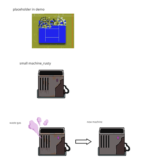
As for the puzzle assets, we mainly used placeholders in the demo. Based on those, I created final pixel versions, making it easier for the programming team to replace them directly in the game.
For the machines, I designed a square-shaped model and split its sprite into different states (active/inactive/rusted/emitting gas).
