Weirao Huang


Pieces
Team: Prism Inc.
Role : Game Designer & Game Artist
Genre: Puzzle Game


Project Summary
Our game is called Piece, it is a story-rich exploration game on PC featuring 2D isometric gameplay. Since we are taking part in the CYC collaboration, our target audience are kids aged 8 - 12.
This was my first time experimenting with a watercolor art style and creating a cutscene. It was a big challenge for me, but also a great opportunity to explore a different visual style and improve my artistic adaptability.
Tool
-
Godot
-
Photoshop
-
Miro
-
Live2D
-
Discord
Procees Work
Pre-production:
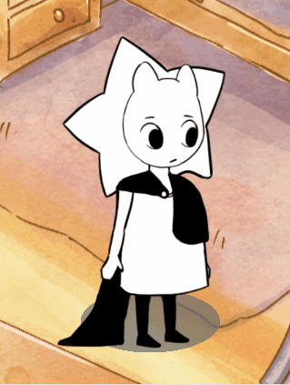
After confirming the character profile with the narrative designer, I began creating brainstorming sketches for the main character.
We wanted to design a neutral character that anyone could easily relate to and project themselves onto.


Reference:


For the concept art, I created the visual direction for the project.
The style we confirmed combines the SEL (Child and Youth Care Challenge) theme with a watercolor aesthetic, aiming for a soft and peaceful overall tone.l
Some early-stage character design explorations.


During pre-production, we received feedback regarding accessibility for color-blind players. Since our game uses colors to represent different emotions, this could create challenges for players with color vision deficiencies. In our proposal, we suggested using alternative visual indicators.
As the artist, I researched and tested whether we should incorporate different textures to represent different colors, ensuring that emotional states could still be clearly distinguished without relying solely on color.
Here is a case study video that I have done while working on pre-produce character design
Art Process:
For the finalized character design, I created different side-view versions that would be used for the in-game character model.


For the character design, we wanted to create a cute pet companion for the player. So I developed a new round of sketches, all centered around the theme of being cute and playful.


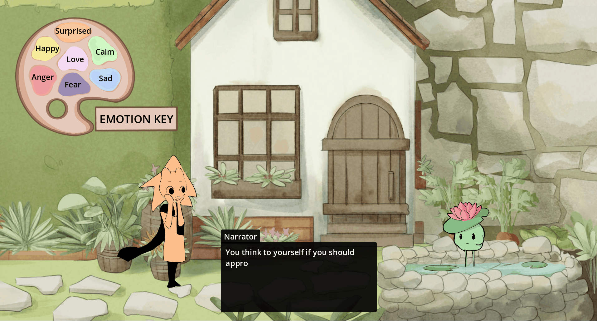
For the second NPC, I needed to design a creature that lives in a pond. The theme I was given was:
Lotus + Pond.


For the atmosphere design of the main character’s room, since our game uses different colors to represent different emotions, I primarily used warm tones (positive colors) to color the entire room, mainly focusing on yellow and orange. This allows players to feel a sense of warmth in the space.
At the same time, I also incorporated a small amount of other colors. Because negative emotions still exist in real life, I included subtle touches of blue to reflect that emotional balance.
In Engine:
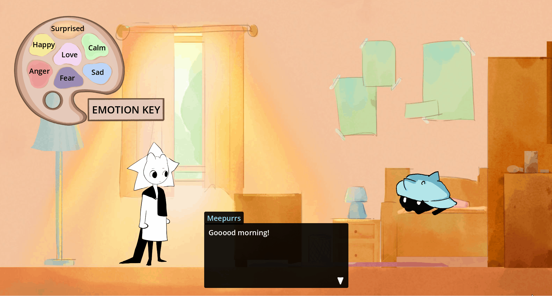
Because the main character will have thinking bubbles in the game that display facial expressions, I created different emotional transition sprites for the character. The colors of these sprites are coded based on our established emotion-to-color system.

In Engine:


For the main screen background, I created several variations to explore the visual direction. My goal was to present a peaceful atmosphere, so that when players enter the game, they can immediately feel the calm and gentle tone of our world.
I also animated the background to make it more lively, cute, and engaging, helping to draw players in and encourage them to continue playing.

In Engine:


For the garden scene, I mainly used green as the dominant color, since green represents calmness in our emotional system.
Compared to the bedroom side view, I designed the garden with a slightly top-down perspective. I believe this allows players to see the pebbles on the ground more clearly and adds a stronger sense of depth and volume to the environment.

In Engine:
During development, we found that many playtesters felt that the game and the main character’s backstory were not clearly explained. As a result, we decided to create an opening cutscene to better introduce the protagonist’s background.
I then used a storyboard format to continuously iterate and refine the visual narrative for this cutscene.
Final version

For the main screen UI, I combined elements from the game’s core concept (emotions and thoughts).
I incorporated thinking bubbles as well as visual elements from the character design, such as the hat and stars.
For the title, I used a rounded and soft font style to match the overall tone of the game. For the buttons, I chose a handwritten style to align with the journal and everyday-life elements presented in the game.


Reference:


Reference:


Reference:


I created different emotional states for each character. Based on their individual designs, each character has a distinct visual approach to expressing emotions. For example:
Meepurrs – The emotional states are designed based on cat-like emotional changes and behaviors.
Gup – The lotus flower on Gup’s head changes according to different emotions:
-
Love: The lotus flower blooms larger, and the lotus leaves become flatter.
-
Happy: A yellow glow appears in the center of the lotus flower, matching the color associated with happiness. The lotus leaves also become flatter.
-
Fear: The flower closes up, the lotus leaves droop downward, and the flower’s color becomes paler.
-
Calm: The head is slightly raised compared to the normal state.
-
Anger: The flower’s color becomes a deeper red.
-
Sad: The flower’s color fades, petals fall off, and water droplets appear on the petals.
-
Surprise: Petals fall off, and the lotus leaves become flatter.
Main Character – The emotional changes are expressed in a more human-like way, but the star element on the character also reacts uniquely:
-
Surprised: The star’s points become sharper.
-
Angry: The star droops downward and expands outward.
-
Fear: The star shrinks.
-
Calm: No change.
-
Happy: The star lifts upward.
-
Love: The star becomes more rounded.
-
Sad: The star droops downward and expands outward.
For Boggy’s character design, he is meant to be a funny and lively character, and he also goes through a mindset transformation during the story.
Because of this, I intentionally created a clear visual distinction between his before and after states. Since Boggy later goes on a journey, I added travel-related elements to his after state, such as a backpack, boots, and a walking stick, to visually reflect his growth and new direction.


For the school area, I set blue as the dominant color. Blue represents wisdom, but it can also carry a sense of sadness, which reflects how kids (our target audience) may sometimes perceive school.
I also painted a large tree outside the window. This helps introduce warmer tones into a primarily cool-colored scene, preventing it from feeling too
monotonous. At the same time, it subtly suggests that the outside world may feel more appealing to them. It also enhances the sense of depth, so the player’s view does not feel confined within the classroom.